Design Guide

We take design seriously

This page will give an overview of why and how

Why design matters?

At Reflective Data we believe that good design can help us (and vice versa).

We know perfectly well how easily the amount of data can become overwhelming. Yes, we do say that the more data, the better - but we also know that it's super important to draw out what's important.

Plain data in databases, tables or on dull graphs is bad. It takes a lot of time and research to understand what it tells you, and without being a professional you will hardly find something useful.

Our target group contains marketers, analysts, optimizers and others who need to get an overview of how the visitors are using the website. We know these people are busy, we do our best to make them get what they were looking for as fast as possible.

Reflective-data-colors-dimensions

Reflective Data Colors

We like colors, why not use them to help our users?

Our goal here is to make most out of the data we (help our clients to) collect.

Colors are one of the best ways to empathize what's important, and in a world full of data, this is exactly what we need.

So, here's a quick overview of how we are using colors for building Reflective Data.

Why so blue?

As you can see, the primary color related to our brand is blue - you can see it everywhere on our website, blog and the platform.

Actually, blue is one of the most popular colors in web design - and there's a good reason.

Scientists have proved that blue is the color of trust, this also explains why a lot of banks are using blue when creating their brand - CitiBank, Chase, Capital One and many others.

Blue also has a calming effect, which makes it friendly and welcoming, this can probably explain the wide usage of blue by social networks like Facebook, Twitter, LinkedIn etc.

Aforementioned aspects also make blue a perfect choice for us, we want people to believe in the data they've gathered and awake the sense of professionalism, which hopefully triggers them to take actions based on data.

We also believe that using blue helps us creating the emotion which would make our visitors come to our platform and blog more often, and therefore, make their decisions more data-driven.

Secondary colors

Blue, our primary color, is nice and it has a lot of possible variations, but it's just not enough.

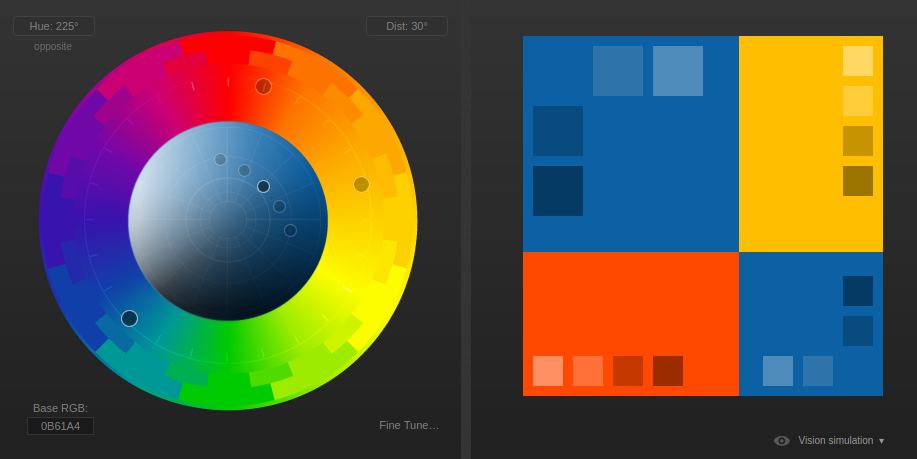
Our secondary colors are red and yellow - we use them in our application, website, blog and of course, in our charts.

Take a look out Reflective Data color palette here.

Of course, we do not limit ourselves using these colors only, but having fixed colors related to a brand is nearly always a good idea. Especially, when you can put the why somewhere in the decision-making process.

Triad-based colors

A color triad is a set of three different colors on a color wheel that are an equal distance apart from each other. Color triads are often used in color schemes that require both contrast and balance.

Reflective Data Color Triad
Screenshot from http://paletton.com/

Reflective Data Logo How It's Made

Logo components

Reflective Data logo contains two main components: a round figure combining letters R and D, and a text with all lowercase letters 'reflective data'.

These two components can be used together (figure top, text bottom) or separately. In most places where there is enough space, using both is preferred. E.q. documents, page body, general content

Using logo in places where width or width and height are limited using the figure alone is suggested. E.q. favicons, buttons, icons etc.

Putting Reflective Data logo into a place where height is limited, using just the text part is accepted. E.q. banner bars, inline text etc.

The figure

The round figure contains uppercase "R" and lowercase "d".

This part of the logo is made with very little anchor points, 16 to be precise.

There is a big circle, a hole in it and a small circle inside the hole. To draw out the letters, 3 extra rectangles are being added (erased from the figure).

The text

Text part of Reflective Data logo contains two words "reflective" and "data", all lowercase letters.

The font used in the text part is 176MKSD.

Reflective Data Logo on White Background

Gradients

We use CSS gradients in several places on our websites. We use this tool for creating and testing them.

Samples:

background: rgb(2,0,36);
background: linear-gradient(90deg, rgba(2,0,36,1) 0%, rgba(9,9,121,1) 32%, rgba(0,212,255,1) 100%);
 
background: rgb(11,97,164);
background: radial-gradient(circle, rgba(11,97,164,1) 0%, rgba(255,73,0,1) 100%);


Complete User Behavior Analysis

 Our main goal is to build products that will help you easily get insights on how people are using your website. What makes them take actions or what holds them back.